Minimalist website design: 12 striking examples By Creative Bloq Staff, Mark Billen published 23 April 24 Web Design These minimalist site designs prove that less can be more.
The best code editors in 2024 By Jeffrey L Smith, Craig Grannell last updated 8 August 23 Web Design Discover the best code editors available now.
The best online coding courses in 2024 By Tom May last updated 6 June 23 Career Paid-for and free coding courses to hone your skills.
Freelance finance: how to make more money By Craig Grannell last updated 22 April 23 Freelance Learn how to best manage your funds as a freelancer.
The best UI design tools By Carl Cahill, Tom May last updated 20 March 23 Web Design Discover the best UI design tools available today.
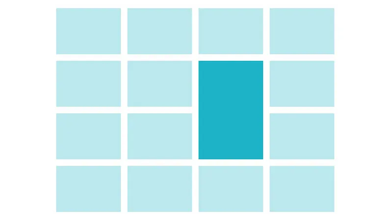
The 7 secrets for creating balanced page layouts By Sam Hampton-Smith published 29 October 22 Graphic Design The essentials of page layouts for print or digital UIs.
The ultimate UI design guide By Daniel Schwarz last updated 28 September 22 Web Design Top techniques and the latest tools for creating great interfaces.
9 tips for smashing UX design on a budget By Abi Fawcus published 4 August 22 UX This is how to master UX on a budget when working for small businesses.
Get to grips with UX theory By Joshua Garity published 29 June 22 UX How to strike a balance between needs and expectations.
6 UX lessons you can learn in the toilet By Chris How published 18 May 22 UX Bathrooms can offer some surprising UX lessons.
How learning people skills can be like gaining a superpower By Jonathan Kahn last updated 29 April 22 Business If you struggle in your job to receive appreciation for your contributions, find time to develop your skills and find meaning in your work, it's easy to feel frustrated.
The future of frameworks: What's in store for the rest of 2020? By Daryl Bartlett last updated 29 April 22 Web Design We take a look at the current state of frameworks Angular, React and Vue.
20 UX tips you need to know By Jamie Shanks published 11 April 22 UX UX tips from an industry insider, guaranteed to up your game.
19 really useful responsive web design tutorials By Creative Bloq Staff last updated 11 April 22 RWD Optimise your website with these responsive web design tutorials.
8 amazing CSS techniques to use right now By Rachel Andrew published 6 April 22 Web Design Explore the most exciting CSS that's now in a browser near you.
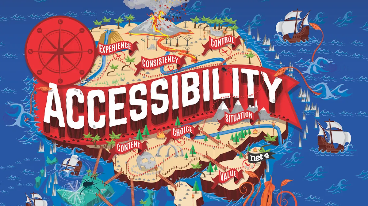
How to make your app accessible By Richard Pilton last updated 1 April 22 Apps 6 steps to ensuring your app is accessible to all.
The 6 UX pillars that make for the best user experience By Karolina Mrozwska published 24 March 22 UX These UX pillars provide the basis for all great user experience design.
Get UX testing right with these 10 essential steps By Joshua Garity last updated 24 March 22 UX The UX testing tips you need to know to nail user experience design.
The best SEO tools By Richard Baxter, Joseph Foley published 1 March 22 Web Design The best SEO tools, both free and paid for, to build your website's following.
How to unify your UX across platforms By Joshua Garity last updated 25 February 22 UX Discover how to make a seamless UX across various devices.